~ The Redefined Life ~ September 29, 2025
When it comes to living with color, bold colors can be your best inspiration—or your biggest disaster. While cool whites and subtle patterns have long dominated the home scene, many homeowners and designers are now craving color and bold patterns, and are doing a 180-degree turn, abandoning the stark whites and turning to vibrant hues and shapes to add energy, personality, and drama to their spaces. But how do you embrace bold color and patterns without feeling like you live inside a crayon box?
Living with color should not distract or agitate us; it should nurture our senses and center us. Please use it purposefully. Remember, as you introduce bold colors into your décor, we are naturally drawn to color and light. Keeping that in mind, put light and color to work for you and place them where you want to draw people’s attention. To tastefully bring color into your home, don’t scatter it here and there; instead, let it entice you, drawing you into a space where you will feel your spirit is nurtured. The above photo (potterybarn.com) is a tasteful example of using bold color to create an enticing atmosphere that is exciting and yet calming.
Whether you’re a color enthusiast or a hesitant beginner, here’s how to beautifully integrate energizing colors into your home.
Start Small and Build Confidence
If you’re hesitant, begin with small doses. Think throw pillows, vases, picture frames, an ottoman, or accent chair. These elements are easy to change and allow you to experiment without commitment. Have fun and change the colors as the seasons change. You will instinctively “feel” whether a color feels good in a room; not all colors feel right in certain compass directions.
Being a holistic designer, I always respect the directional position of a room, e.g., north, south, east, west, etc. Respecting the compass direction’s energy will create harmony in the space; if it is ignored, the space will feel “off” and cause us to feel anxious or uneasy. If you want to implement a lot of bold, saturated colors into your décor, let’s talk before you spend hundreds of dollars (click here); this will help you make informed decisions and wise purchases. Until then, go ahead, have fun experimenting with splashes of your favorite colors. If they bother you after a few days, remove them and replace them with other colors; trust your inner voice.
Try this: Add splashes of reds to a neutral sofa and then place an orange vase or accent on a wooden coffee table or wooden tray on an ottoman. Instant “WOW”!

(photo credit: luxesource.com)
Use Bold Colors as Accents
Rather than painting an entire room bright electric blue, consider using a few complementary bold colors as strategic accents, or select a single wall to have a bold accent instead of the whole room. Having an accent wall can add depth and also create a dramatic focal point to the room.
Tip: Try a relaxing contrast wall color for a stunning bedroom accent wall, or try a bold yet dreamy wallpaper mural to add personality without overwhelming the space. In the example below, the wall mural is the anchor of the room; all other elements are neutral and calm with no patterns. This prevents our senses from being overwhelmed.

(photo credit: wallsauce.com)
Pair Bold Colors with Neutrals
Bold colors shine brightest when paired with neutral tones such as white, gray, beige, or soft wood tones. Neutrals act as a calming counterbalance, and make bold hues feel more intentional and curated. Remember my mantra, “less is more”. This applies to adding bold colors and patterns. Let the neutrals create calmness for the eyes and mind, and then strategically add a burst of color that tickles our senses without overwhelming them.
Example: A mustard yellow accent looks sophisticated against a white or charcoal backdrop.

(photo credit: www.pixelshouters.com)
Play with Color Blocking
Color blocking—using solid blocks of contrasting or complementary colors—is a modern way to incorporate bold tones. This can be done through wall paint, artwork, rugs, or even cabinetry. Using contrasting neutrals as color blocks can be a beautiful way to embrace this new trend. It not only soothes our senses, but it also adds interest and sophistication, and will remain stylish long after the current bold color trend becomes excessive.
Pro tip: Use the 60-30-10 rule—60% dominant color, 30% secondary color, 10% accent (your bold pop!).

This color blocking with neutrals creates a modern, sophisticated look. (photo credit: decorilla.com)
Bring in Bold Through Art and Accessories
Artwork, rugs, and light fixtures are perfect opportunities to introduce bold color without altering the bones of your space. These pieces can act as focal points and spark conversations. They can create an uplifting or energizing mood instantaneously.
Think: A bold abstract painting complemented by supportive color splashes in an otherwise monochrome living room can make any room sing, yet not overwhelm the space.

photo credit: Nordic Nest)
Let Nature Inspire You
Bold colors don’t have to feel artificial. Take cues from nature—turquoise oceans, terracotta deserts, sunflower yellows. These organic shades feel grounded, even when bold. And since plants are living nature, include a few thoughtfully placed plants to soften and energize a space.
Try: Incorporate earthy bolds like terracotta, ochre, or deep teal for a rich, cozy vibe.

(photo credit: twentydegreessouth.com)
Balance with Texture and Lighting
Bold colors can feel overwhelming in flat, matte finishes. Soften the look with rich textures (like velvet, wood, metal) and ensure you have adequate lighting to make the color feel vibrant rather than heavy.
Integrate: Soft lighting and warm materials make even the boldest color feel luxurious. This vibrant terra cotta room is softened by natural light, velvet pillows, and wood accents.

Don’t Forget the Ceiling or Floor
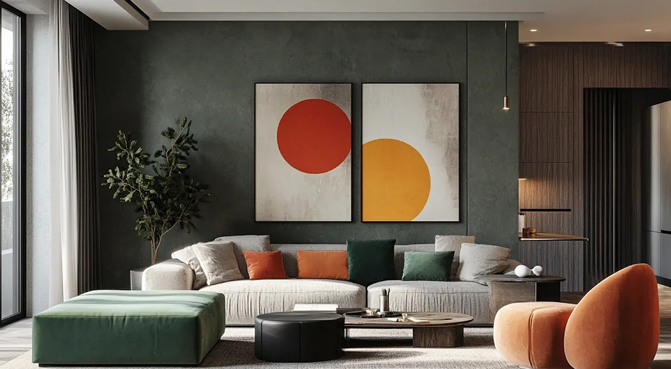
Bold doesn’t just belong on walls! A colored ceiling (also called the “fifth wall”) or a statement rug can dramatically change the look of a room without cluttering it. This needs to be carefully thought through because darkening a ceiling will make it feel heavy above you, and over time, it can feel crushing or drowning. Talk to a professional before investing in a bold color on the ceiling, or schedule a visit with me. You may want to try a bold area rug before adding drama above your head.
Why the example works: I rarely recommend a dark charcoal ceiling, but for illustration purposes, the example below is a good example of a dramatic ceiling creating a striking and elegant statement. It works because the windows create walls of natural light, and the colorful painting with accent lighting above it brings light and color into the room at eye level. Remember, we are naturally drawn to light and color, and this space calms our senses by using it to the fullest. The sectional and rug create an anchor that helps us feel grounded, another calming tactic. Even though this space is bold, dramatic, and elegant, I suspect the décor will be changed sooner than later, because the dramatic colors will eventually suppress the occupants who live there on a daily basis.

(photo credit: GYJAGHL Paintings Gallery)
Be Bold, Be You, but Be Grounded
What is the most important rule? Make it personal and balanced. Color should reflect your taste and make your home feel like you. Whether you choose jewel tones, bright neons, earthy pigments, or neutrals, the key is to find balance and joy in the process. The bold trends of 2025 and 2026 are not for everyone, and many, including myself, anticipate that this trend will be short-lived. If you enjoy redecorating or remodeling frequently, then jump on this trend and have fun. If you prefer long-lasting décor, remember our soul loves warm, natural tones that keep us safe, grounded, and in touch with our natural rhythms, so add splashes of fun colors to a neutral palette that integrates hints of earth elements, such as wood, stone, metal, and a plant or two.
Leave A Comment